
Ensuring Your Website Performs Well on All Devices
In today’s fast-paced digital landscape, having a mobile-friendly website is no longer an option – it’s a necessity. As the majority of users access the internet through their smartphones and tablets, businesses must adapt and provide an optimal browsing experience on all devices.
Why is Mobile-Friendly Web Design Important?
Increasing Mobile Usage
According to recent statistics, over half of all web traffic comes from mobile devices. This trend is only expected to grow in the coming years. With the increasing reliance on mobile devices to access the internet, ensuring that your website is optimised for these users is essential.
Improved User Experience
A mobile-friendly website provides a better overall user experience for visitors. It’s designed to fit the smaller screens of smartphones and tablets, with easy-to-read text, large buttons, and simplified navigation. This enables users to access your content quickly and efficiently without zooming or scrolling horizontally.
Higher Search Engine Rankings
Search engines like Google and Bing prioritise mobile-friendly websites in their search results. If your website isn’t optimised for mobile devices, it’s less likely to appear in top search results, leading to decreased visibility and potentially lost business.
Increased Conversion Rates
Mobile-friendly websites typically have higher conversion rates, as users are more likely to remain on a website that’s easy to navigate and interact with on their devices. This can lead to increased sales, newsletter sign-ups, and other valuable actions for your business.
Future-Proofing Your Website
As technology evolves, staying ahead of the curve and adapting your website to new trends and devices is crucial. A mobile-friendly website design ensures that your site will be easily accessible on future devices and platforms, helping to future-proof your online presence.
Tips for Ensuring Your Website Performs Well on All Devices
Use Responsive Web Design
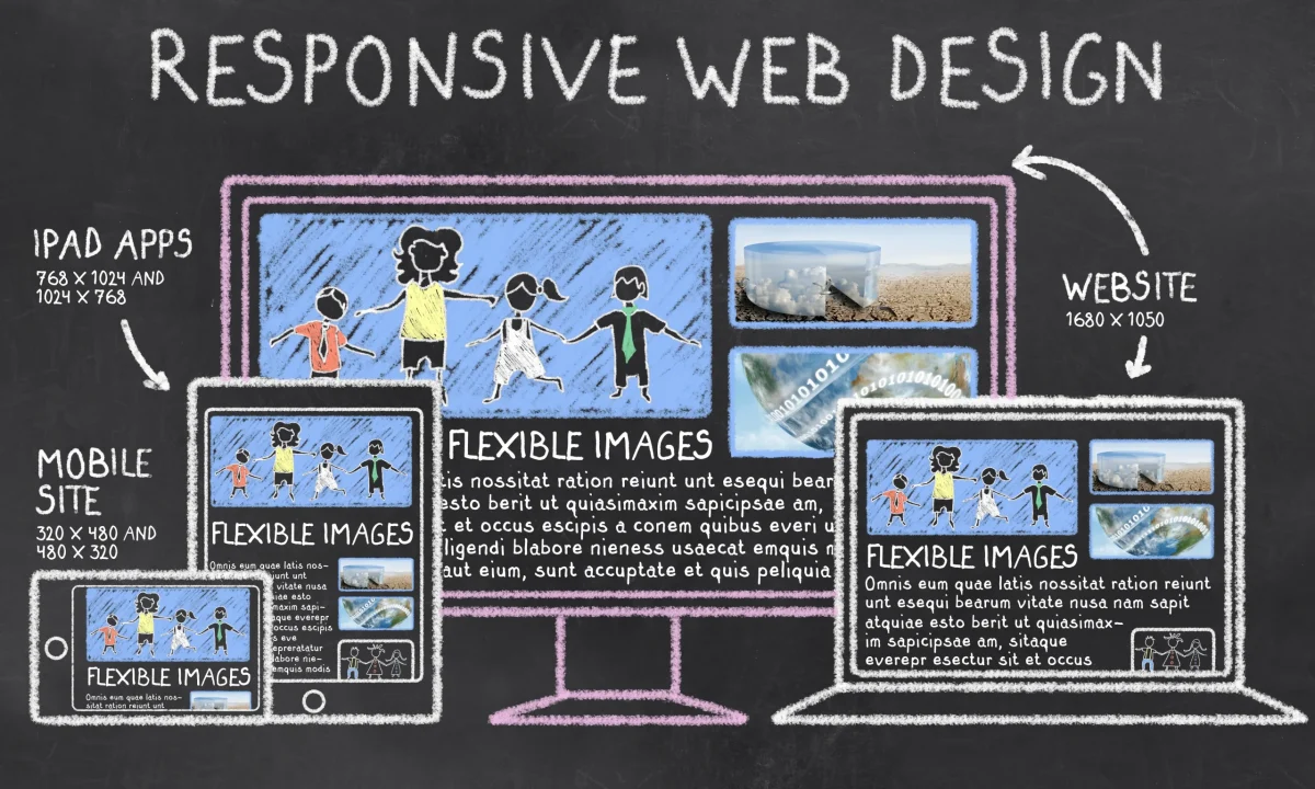
Responsive web design is an approach that allows your website to automatically adjust its layout and elements based on the device it’s being viewed on. This way your website will look great on smartphones, tablets, and desktop computers, without needing separate versions of your site.
Optimise Images and Media
Large, unoptimised images and media files can slow your website’s loading time, especially on mobile devices. Compress and optimise your images and use the correct file formats to ensure your site loads quickly and efficiently.
Simplify Navigation
Mobile users typically need more patience for complex navigation menus. Therefore, keep your website’s navigation simple and easy to use with clear, concise labels and a limited number of menu items.
Prioritise Content
On smaller screens, it’s essential to prioritise the most crucial content and keep it front and centre. Ensure your calls to action, headlines, and critical information are prominent and easily accessible.
Test on Multiple Devices
Testing your website on smartphones, tablets, and desktop computers ensures it performs well on various devices and screen sizes. This will help you identify issues and optimise your site for the best possible performance.
Having a mobile-friendly website is imperative in today’s digital landscape. It provides a better user experience for your visitors, improves your search engine rankings and conversion rates, and future-proofs your online presence. By implementing responsive web design, optimising images and media, simplifying navigation, prioritising content, and testing your site on multiple devices, you can ensure your website performs well on all devices and stays competitive. Find out more about our mobile-friendly website design services.